
Boardroom-Ready Infographics, Fast
Create a clean corporate infographic — professional blue palette, crisp icons, structured grid — from a prompt in about a minute.
Sign in, new accounts get 10 free credits.
Made with this style

How it works
Start from a text prompt, choose the shape and style, and generate a complete infographic. Then ask for specific changes to the wording, colors, or layout until the result is ready to use.
- 01
Describe
Write what you want in plain language — the topic, the facts, the vibe.
- 02
Generate
Get a polished infographic in about a minute, in the aspect ratio you picked.
- 03
Refine
Change colors, wording, or layout with simple instructions — every version is kept.
What is a corporate infographic?
Corporate style organizes data on a structured grid with a professional blue palette and crisp, simple icons, built for content that needs to look credible in a business setting. It suits quarterly reports, sales enablement decks, B2B case studies, internal training material, and any content going in front of executives, clients, or investors. Marketing and sales teams at established companies use it as their default when the audience expects a polished, business-appropriate look.
Describe the data, process, or comparison you need visualized, and Infolustra lays out a complete corporate infographic in about 60 seconds, structuring it into a clean grid with consistent iconography. If a section, color, or icon needs changing, send a follow-up instruction and the layout updates without a new brief. Switch to another style at any point if the audience or channel changes.
Corporate style handles more information per graphic than most other styles — the grid and consistent iconography let it hold five or six data points cleanly, where a looser style would feel crowded. Keep icon style consistent within one graphic; mixing metaphors undercuts the polished look. Compared with editorial style, which leans on serif typography and a muted palette for a literary feel, corporate stays structured and blue-toned — use corporate for business audiences, editorial for a magazine-style read.
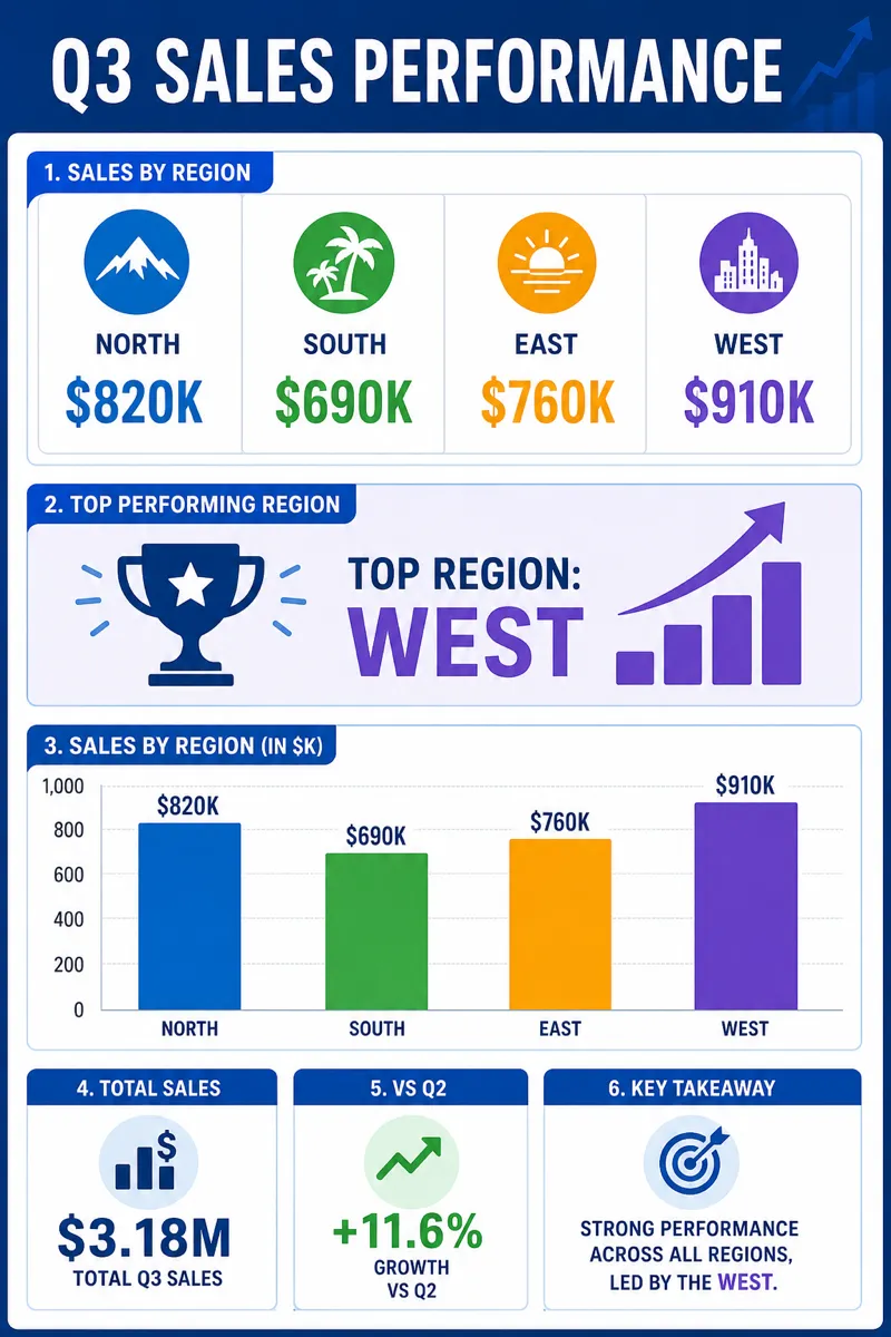
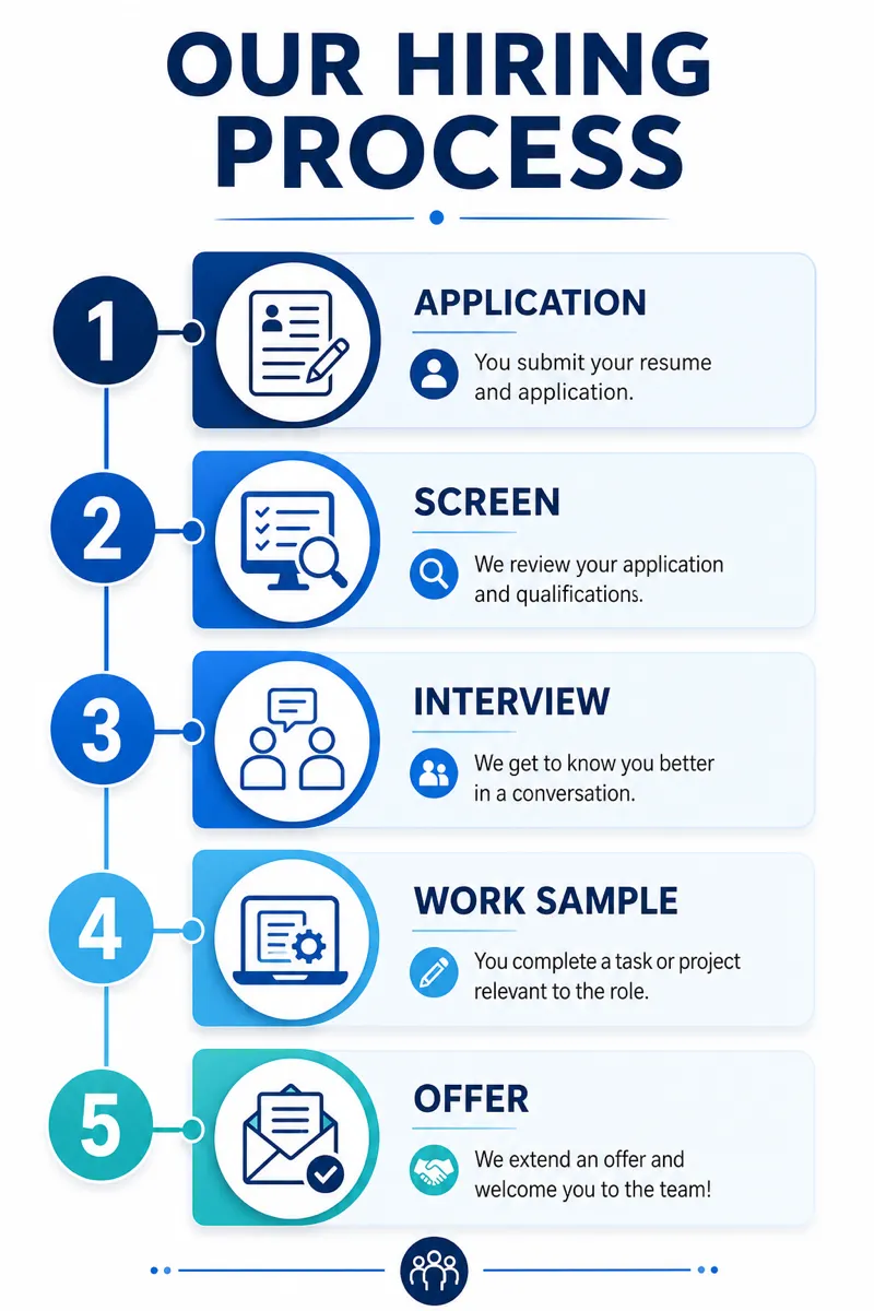
Sales teams use corporate infographics for account reviews, while operations leaders use them for training and policy rollouts. A quarterly recap can combine regional results with next actions; an onboarding graphic can show roles, systems, and approval steps on one structured page. In your prompt, provide the audience, the business context, and the exact metric labels that must remain accurate. Ask for consistent icons and a restrained palette so decoration does not make the material look less credible.
Frequently asked questions
Make your first infographic
Describe an idea, generate it in about a minute, and refine it until it looks exactly right.