
Infographics With a Storybook Feel
Generate a watercolor-style infographic — soft washes, organic edges, a storybook feel — from a prompt in about a minute.
Sign in, new accounts get 10 free credits.
Made with this style
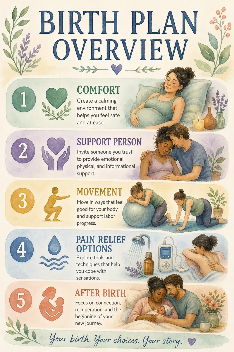
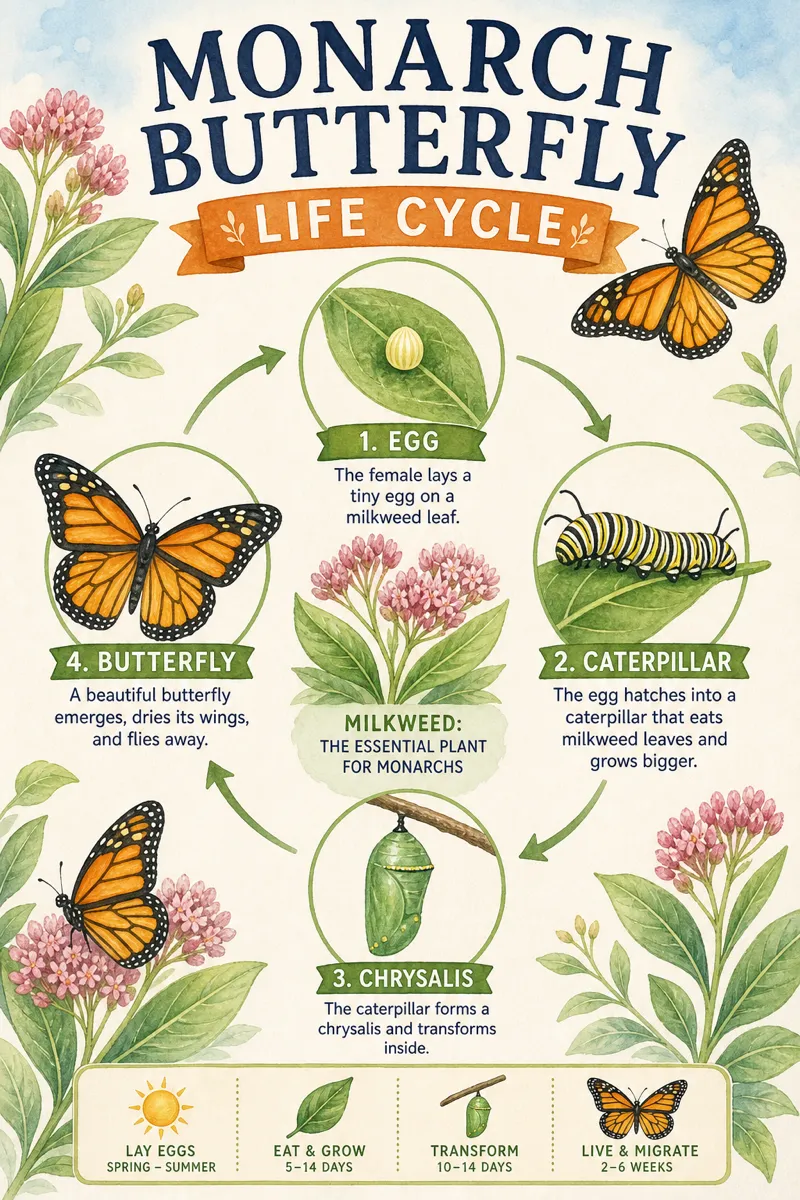
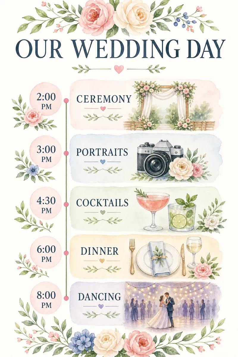
How it works
Start from a text prompt, choose the shape and style, and generate a complete infographic. Then ask for specific changes to the wording, colors, or layout until the result is ready to use.
- 01
Describe
Write what you want in plain language — the topic, the facts, the vibe.
- 02
Generate
Get a polished infographic in about a minute, in the aspect ratio you picked.
- 03
Refine
Change colors, wording, or layout with simple instructions — every version is kept.
What is a watercolor infographic?
Watercolor style renders each element with soft color washes and organic, slightly imperfect edges, giving content a gentle, storybook quality rather than a sharp graphic one. It suits wellness and lifestyle brands, children's content, wedding and event material, and any piece meant to feel warm and personal rather than efficient. Wellness coaches, small creative businesses, and brands with a softer visual identity choose it over more graphic styles for exactly that reason.
Describe the idea, story, or steps you want illustrated, and Infolustra paints a complete watercolor infographic in about 60 seconds, keeping the washes and edges consistent across the piece. If a color, shape, or amount of detail needs adjusting, send a follow-up instruction and the same painting updates. Switch to a different style at any point without losing your content.
Watercolor style reads best with a handful of soft, rounded shapes and gentle color transitions rather than sharp lines or dense text, since the whole appeal is in the imperfect, hand-painted texture. Pastel and muted tones suit it more than bright, saturated colors, which fight the soft-wash effect. Compared with sketch-note style, which stays graphic and linear with ink and marker, watercolor is softer and more atmospheric — pick watercolor for mood and warmth, sketch for structure and notes.
Frequently asked questions
Make your first infographic
Describe an idea, generate it in about a minute, and refine it until it looks exactly right.