
Infographics Stripped to the Essentials
Generate a minimalist monochrome infographic — one accent color, thin lines, extreme white space — from a prompt in about a minute.
Sign in, new accounts get 10 free credits.
Made with this style

How it works
Start from a text prompt, choose the shape and style, and generate a complete infographic. Then ask for specific changes to the wording, colors, or layout until the result is ready to use.
- 01
Describe
Write what you want in plain language — the topic, the facts, the vibe.
- 02
Generate
Get a polished infographic in about a minute, in the aspect ratio you picked.
- 03
Refine
Change colors, wording, or layout with simple instructions — every version is kept.
What is a minimalist infographic?
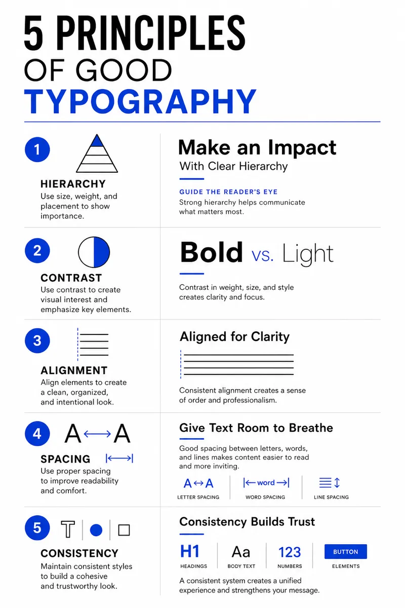
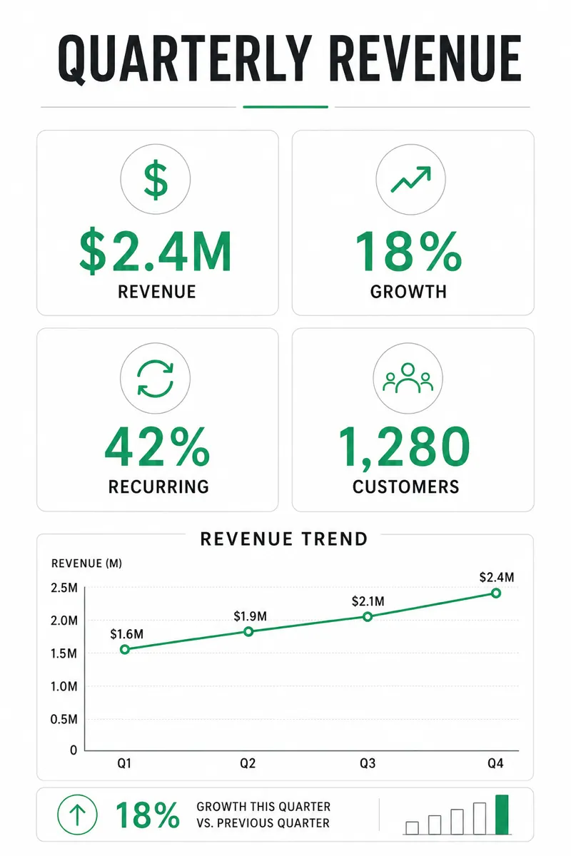
Minimalist style strips an infographic down to monochrome shapes, thin lines, and a single accent color, with as much white space as the content allows. It suits high-end product launches, portfolio and personal-brand content, investor decks, and any context where restraint reads as confidence rather than a missed opportunity to add more. Designers, consultants, and premium consumer brands often reach for it when a busier style would undercut the tone.
Describe the single idea, comparison, or statistic you want to communicate, and Infolustra produces a complete minimalist infographic in about 60 seconds, choosing one accent color and keeping everything else restrained. If the accent color, spacing, or line weight needs adjusting, send a follow-up instruction and the image updates. Switch to a different style at any time without rewriting your content.
Minimalist style rewards one clear message over multiple competing points — this is a style where less content produces a better result, not a weaker one. Pick one number or one idea as the visual focus, and let the accent color point directly at it. Compared with corporate style, which adds structure, icons, and a fuller palette, minimalist removes almost everything — use corporate to look established, minimalist to look confident and deliberate.
Consultants use minimalist infographics for executive summaries, and designers use them for portfolio highlights where one result should lead. A board update might center on a single retention change with two supporting facts; a launch graphic might pair one product image with three short benefits. In your prompt, identify the one element that must dominate and state what can be omitted. Minimalism fails when every fact is treated as equally important, because white space alone cannot create the missing hierarchy.
Frequently asked questions
Make your first infographic
Describe an idea, generate it in about a minute, and refine it until it looks exactly right.