
Free graphical abstract maker
Turn your paper's central finding into a graphical abstract from pasted text, then refine wording, colors, and layout with follow-up instructions.
Sign in, new accounts get 10 free credits.
What does a graphical abstract look like?
How it works
Start from a text prompt, choose the shape and style, and generate a complete infographic. Then ask for specific changes to the wording, colors, or layout until the result is ready to use.
- 01
Describe
Write what you want in plain language — the topic, the facts, the vibe.
- 02
Generate
Get a polished infographic in about a minute, in the aspect ratio you picked.
- 03
Refine
Change colors, wording, or layout with simple instructions — every version is kept.
How do you make a graphical abstract for a paper?
A graphical abstract is the single visual summary shown beside your paper's title on a journal page or listing site. It should communicate the central finding in a few seconds: the system you studied, the method or mechanism, and the main outcome. To generate a first draft here, paste the key sentences from your abstract or results, including the finding, the mechanism, and the numbers that matter, rather than only the paper title. The generator follows the exact terminology you supply, which keeps the labels closer to your paper than a generic description would.
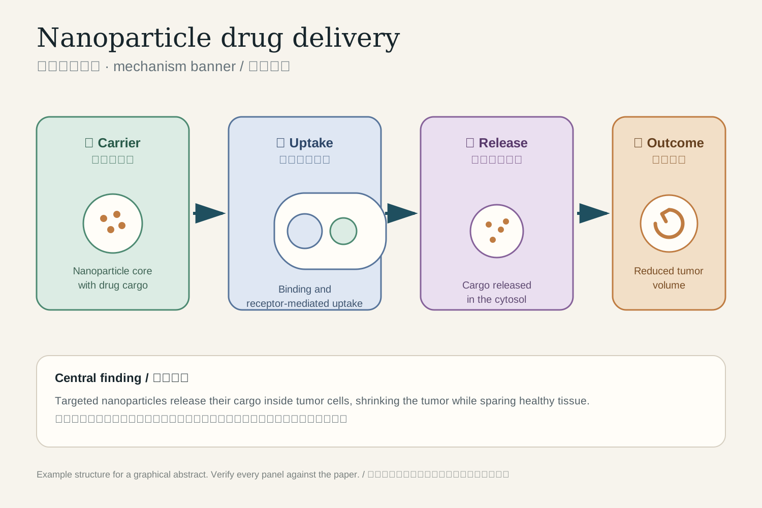
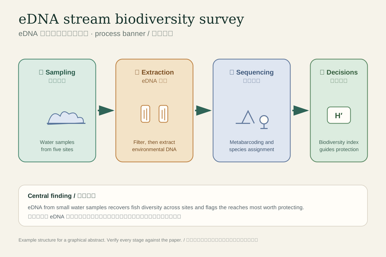
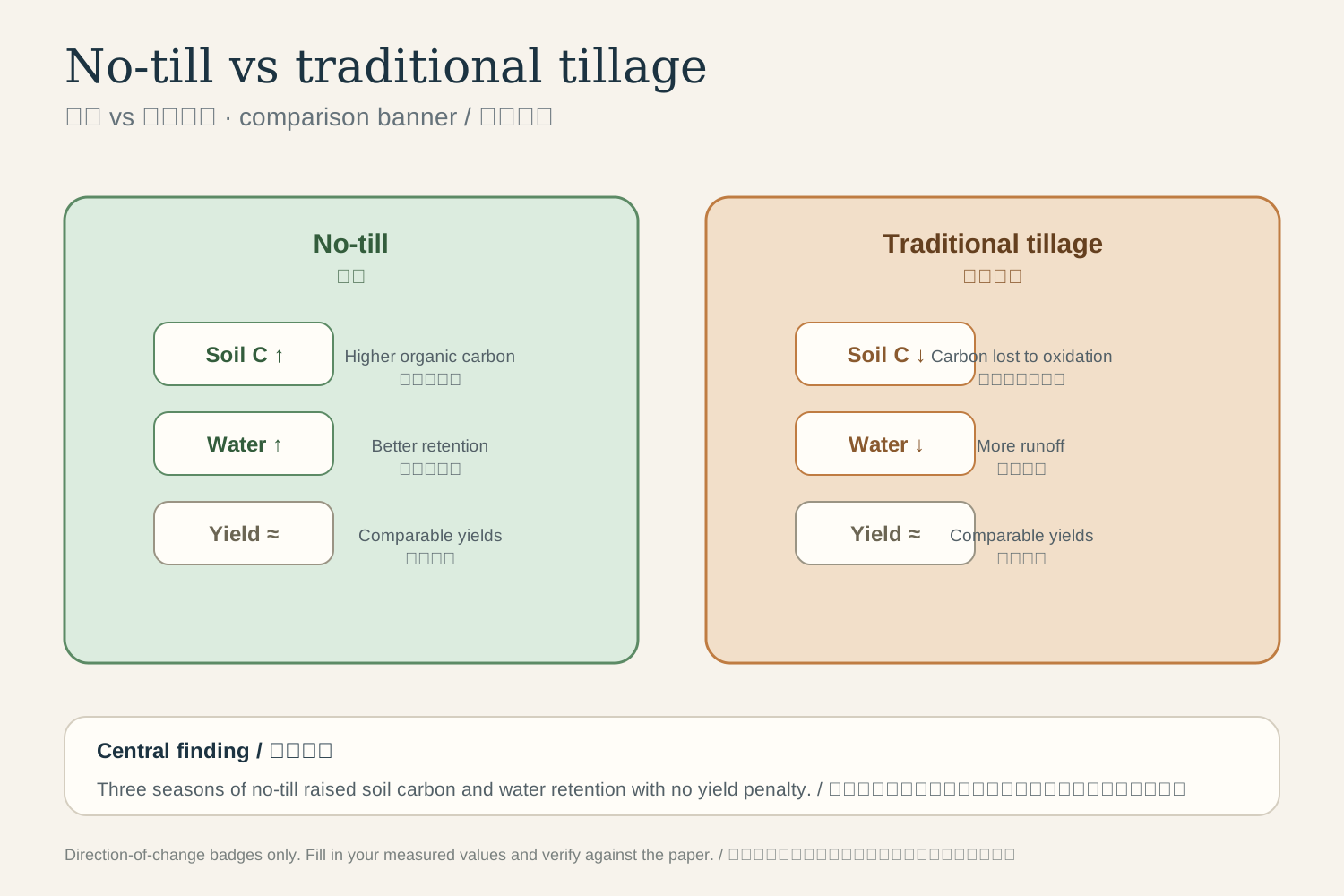
Pick a structure that matches the story. Mechanism papers usually work as a left-to-right banner with two to four panels connected by arrows. Process or field studies work as a pipeline of stages with one icon each. Comparison studies work as matched columns with outcome badges. Most journals prefer a wide landscape image with minimal text, readable at a small size, and no invented data. Keep one term per concept. If the paper says photosynthetic efficiency, the label should say the same, and let arrows carry the causality rather than decorative elements.
After the first generation, compare every panel against the paper: directions of change, relative magnitudes, sample counts, and units. Edit with follow-up instructions, such as shorter labels, a calmer palette, a wider layout, or a different panel order, until the figure is ready to submit. Two honest limits: the output is a raster image rather than an editable vector file, so keep the source description and regenerate when a big change is needed; and journal specifications differ, with Elsevier, ACS, and Cell Press each publishing their own size and format guidance, so check your target journal before submission. The visual is a draft of your finding, not evidence. The data and its interpretation remain the paper's job.
What can you summarize as a graphical abstract?
These starting points match common paper structures. Replace the example content with the specifics of your own study.
- A mechanism study: how a compound, device, or intervention produces its effect.
- A pipeline paper: samples flowing through processing stages to a final result.
- A comparison study: two methods or conditions judged on matched outcome measures.
- A model or simulation: inputs, core mechanism, and predicted outputs.
- A systematic review: search, screening, and the synthesized finding.
- A field study: sites, measurements, and the conservation or policy implication.
- A clinical result: patient flow, intervention, and primary endpoint.
- A materials study: synthesis route, structure, and performance property.
Questions about this format
Make your first infographic
Describe an idea, generate it in about a minute, and refine it until it looks exactly right.